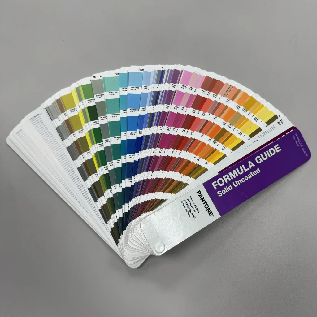


You may have heard of Pantone color guides—those expensive, regularly updated swatch books. At first glance, paying such a cost for a “color sample book” might seem excessive. But for global manufacturers and brands, they are an indispensable peace-of-mind tool.
Pantone has established a universal color language. We no longer rely on vague descriptions like “bright red” or “ocean blue” (which can conjure vastly different images in different minds). Instead, we communicate precisely using a Pantone number. This standardized system ensures that whether your product is made in Asia, Europe, or North America, the same number delivers a highly consistent result.
As for why updates are necessary? Colors evolve with trends, lighting technologies, and material processes. Using the latest version of the Pantone guide ensures accurate color matching—especially critical for brands seeking a premium image and long-term consistency.